Summary Report
Th Summary Report provides an overview of the data categorized by area or location within the organization.
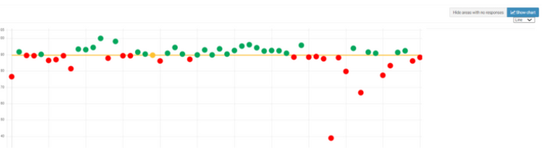
This allows for the comparison of data collected from different areas and for the identification of any areas that stand out, either positively or negatively. The first page of the report displays a chart illustrating all the responses divided by area.
Click the "show chart" button in the top right-hand corner to identify any outliers. It can be viewed as either a line chart or a radar chart.
Line Chart example:
Radar Chart example:
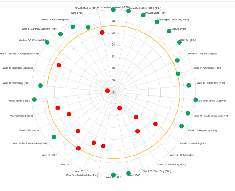
Hover over the outlier to see the name of the area, and then search for that area from your data chart. From there you will be brought back into that specific one sheet report where you can see if the issue is an error or if you need to create an action plan against it.
Next: