View Report
The "View Report" action enables you to customise and view your reports according to your preferences. You can create reports with various visualisations, such as pie, bar, line, and word clouds, as well as "you said we did" reports.
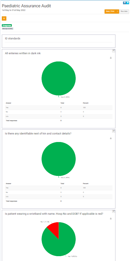
A report provides a detailed breakdown of results for each question in a single project.
Below is an example of a typical report layout:
Report Filters and Personalisation
To filter your results, click on the orange filter button located at the top of the report. Results can be filtered by date or by the services included.
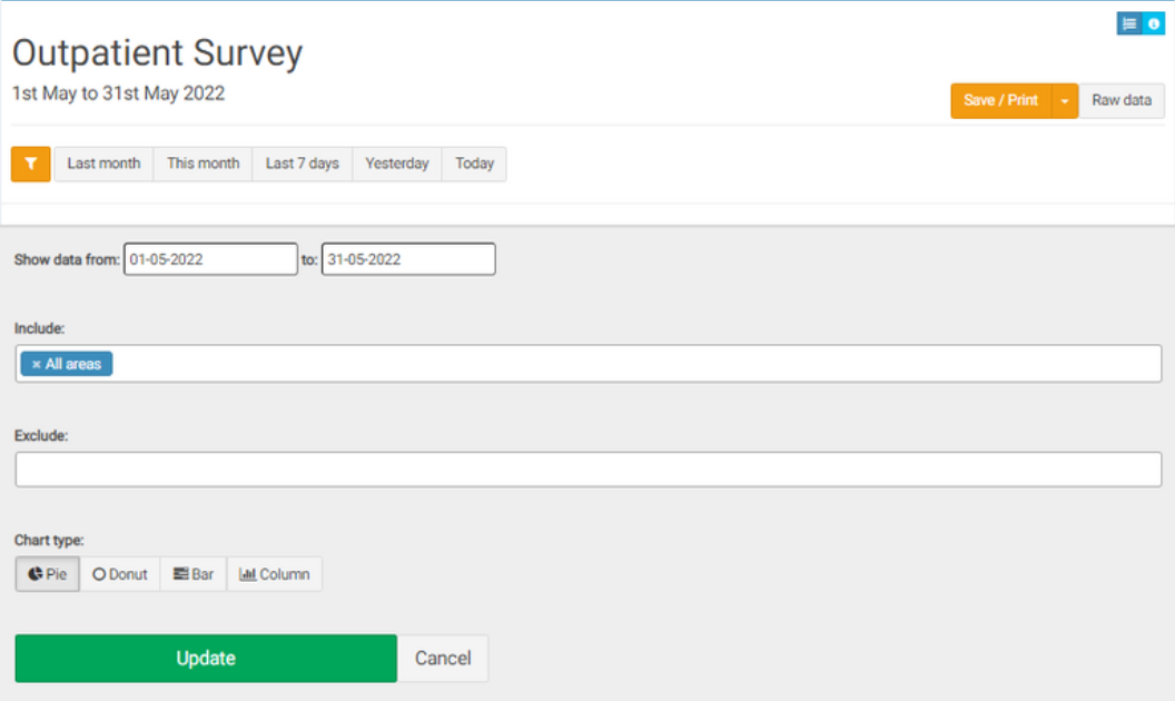
To save the report, click on the orange "save/print" button in the top right-hand corner. It can be saved as a spreadsheet, word document, or presentation. If you want, you can also customise how the data is displayed in these formats.
To view all the raw data from the project, click on the "Raw data" button.
Edit the way in which the charts are displayed by selecting between a Pie / Donut / Bar or Column Chart. The default is a Pie Chart.
Select the “Update” button to generate the chart.
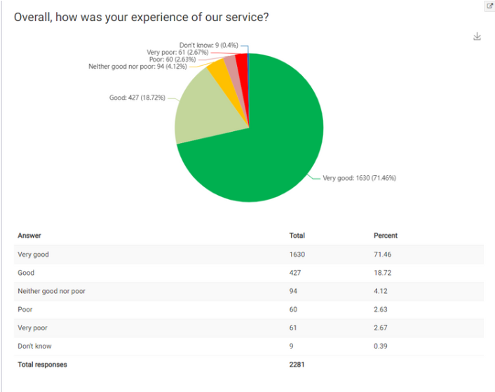
Each question has its own summary chart with a breakdown of responses below it. To download a chart, click on the download button next to it.
Results on comments appear in a table rather than a chart:
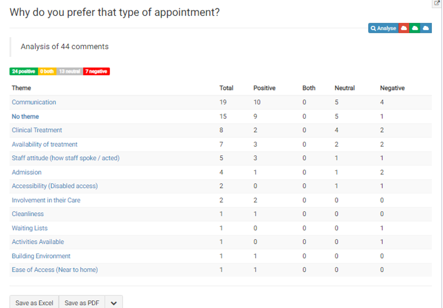
You can search or order any column and export the text into spreadsheet format or PDF.
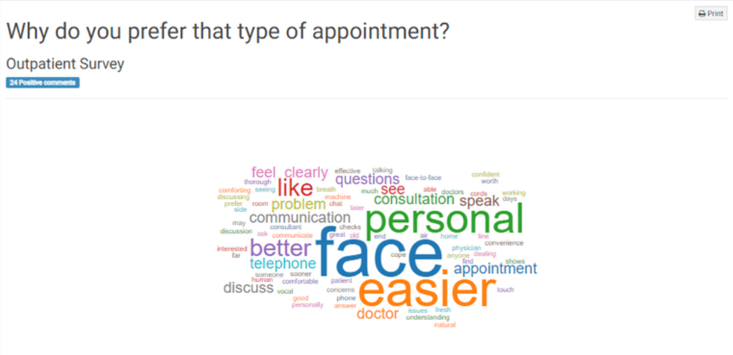
To view a detailed analysis of the comments, click on the blue "analyze" button in the top right-hand corner of the comments table. The icons next to it, in red, green, and blue, allow you to create word clouds for the responses divided by sentiment. The red cloud represents negative comments, the green represents positive comments, and the blue cloud includes all comments.
Here is an example of a positive word cloud:
If you have the appropriate permissions, you can edit the sentiment of the comments here. To do so, go to the "Action" column and click on the corresponding button. The green button changes the sentiment to positive, the white button to neutral, the orange button to both positive and negative, and the red button to negative.
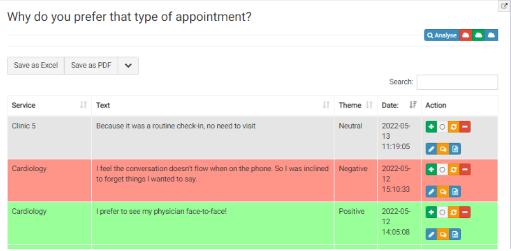
The blue "edit" button allows you to modify the comment, while the orange "speech bubble" button enables you to create a "you said, we did" report relating to that comment. Additionally, the blue button located next to it allows you to view all data associated with that comment.
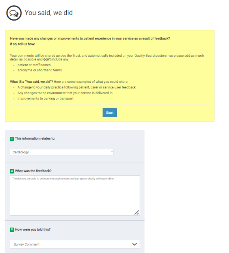
Example of a "You Said, We Did" report, which allows you to take action on certain feedback.
The next item on the action drop down is the "One Sheet Report".
Learn more about it here.